We are constantly being bombarded with visual representations of data. Whether it’s a simple pie chart of the poll figures of the most popular candidate for the next presidential election, a data viz about good data viz, or even a whole selection of some of the essential visualizations about COVID-19; data visualizations are spreading massively, and there’s a reason for that.
EMC says that by 2020, there will be around 40 trillion gigabytes of data (40 zettabytes) and this is only expected to grow after that. With this, the need for good data visualizations arises, since in order to analyze the data and acting upon it would be very inefficient if we had to look at it using massive spreadsheets.
For those uninitiated, check out this great article by Venngage with everything you need to know about data visualizations, best practices and more.
Our brains are excellent at finding patterns, even better if those patterns are presented visually, so presenting data in easy-to-swallow graphics will allow us to understand them much faster and better. This is why the key to make better visualizations lies in our psyche and the relationship between data and visuals.
Below are six key variables that impact data visualization, and how to use the power of human psyche when telling stories with data:
The ‘eyes’ have it- Know the power of these visual elements
The majority of the sensory processing humans do is visual, and it is blazing fast too: about 13 milliseconds is what the brain takes to process an image. So we can make our visualizations much more powerful by exploiting our visual perception attributes.
There are two ways in which our brain processes sensory information: Pre-attentive and Attentive. Pre-attentive is fast and happens when the brain takes basic visual attributes and quickly identifies them. Attentive is the conscious process that happens when we actively look for a specific object within a cluster of things.
Both are necessary to analyze the data, but if we optimize the preattentive process to take the most information possible, we save the time and effort that we need to make conscious decisions.
Our visual perception is triggered by certain attributes in the preattentive process, and it is important to understand them to make the best use of them when creating our data visualizations.
Data tells a story, and there’s one general rule of story-telling that fits perfectly in this case: “Show, don’t tell.”

Preattentive attributes of visual perception. Source: BrightMetrics via Relationship One
See? We don’t even need to explain because our brains are made to recognize these attributes in the blink of an eye. Notice how it’s easier to tell the difference using the shape attribute than the blur attribute? The brain needs more effort to process ones more than others, and that is something you need to take into consideration when designing your visuals.
The power of association
First, let’s look at this famous example of how NOT to make a chart:

Best pie chart ever. Source: Fox News via FlowingData
Fuzzy math will never be your friend. Remember the old adage, "Garbage In, Garbage Out". Duplication or missed data will render your visualization useless no matter how skilled you are as a designer.
If your numbers don’t add up, neither will the visualization. What does 193% mean in this example? Either the data was inaccurate, (probably duplicates or an incorrect total sum), or people could vote for more than one option, in which case the problem was using the wrong type of chart since pie charts have to total 100% in order to represent a 'meaningful' scale.
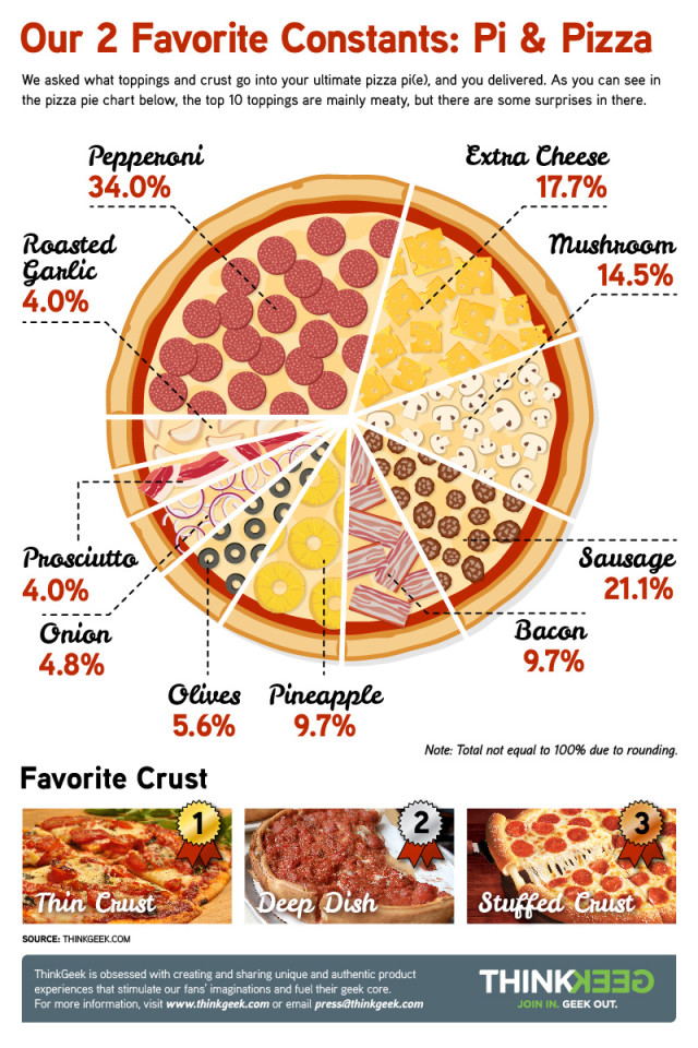
A “pizza chart”. Source: ThinkGeek via The Kitchen Witch
We recognize that pie charts are controversial in some statistical circles, but they remain quite popular with consumers and are still used often in popular culture.
Pie charts are a representation of a whole, we actually learn about pie charts in school while comparing them to a piece of cake or a slice of pizza. So in the case of the pizza, if you eat one slice, that part of the whole (the pizza) will be missing.
That being said, if you make a poll in which a number of people (the whole) get to choose between three candidates, their selections will be represented by a percentage (a slice) of the total number of participants (the pizza), adding up to 100%. Although, if participants can vote for more than one option, the ones that do will appear as duplicates in that whole, breaking the 100% rule, and making it impossible for viewers to associate the whole since our brains are hard-wired to see it as one object (the pizza).
You can’t exploit a visual attribute if PEOPLE can’t see it
Let’s get back to that Fox News’ pie chart example. The main preattentive attribute pie charts want to trigger is the attribute of size, since that’s how we tell the difference between the amount of space each pie takes from the whole. But the difference needs to be much more obvious since it’s difficult to discern which of those pies is larger than the other.
Of course, viewers can still just read the numbers in the labels to know the difference, but then, what’s the point of making the chart?
Now, look at this 3D chart:

3D bar chart. Source: LivingQlik
By nature, 3-dimensional graphs tend to confuse our brains. In this example, the size of each bar is distorted by the perspective we look at it, making it difficult to follow the height of the bars with respect to the Y-axis.
Even worse, that same perspective ruins the visual by making some bars impossible to see since they’re hidden by the ones on the front! How can you trigger the viewers’ visual attributes with invisible values?
The wisest choice, the best result
Bubble charts, funnel charts, bar graphs, bullet charts… Having so many options opens your ground to be as creative as your data allows you to be, but this can also make it more difficult to decide which one to use.
Choosing the wrong visual aid can cause confusion to the viewer as we saw with the examples above. There are some things you need to know before making your call.
Take this Stacked Bar Chart for instance:

Compare sales strategy. Source: Smashing Magazine
Stacked bar charts are used to show the composition of many items while comparing them. In this example, we can see how each of the products performed in relation to various sales strategies while comparing their sales performances. It does this by using the attribute of size to process the height of each bar. Then, it reuses the same attribute again, but this time in combination with the color attribute to see which strategies made each product perform better.
Now look at this Waterfall Chart:
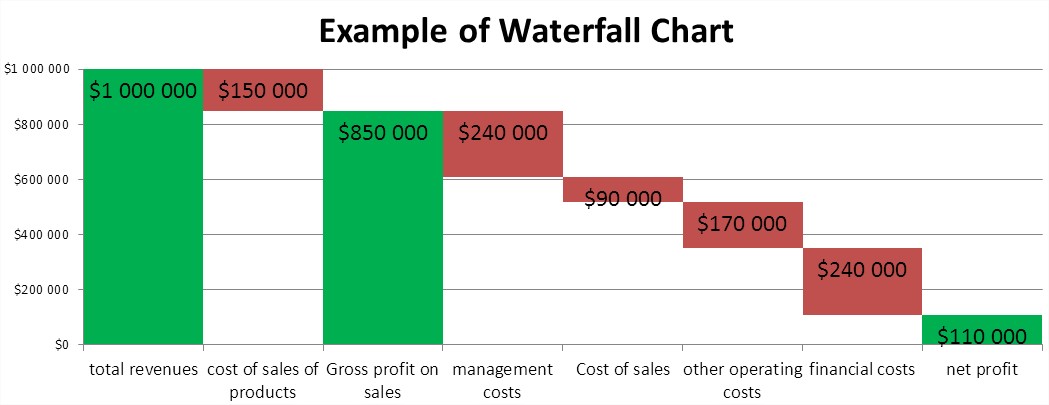
Example of Waterfall Chart. Source: Best Excel Tutorial
Waterfall charts are used to show one initial value and how it is affected by other subsequent values, and the final result. In this case, a company wants to know how the overall revenue is affected by different departments, then shows the resulting net profit. Size, color and position visual attributes are the ones we exploit in this graph.
These are just two examples of how specific charts serve different purposes and how to apply them to real-life situations. Do you want to know all the options you have and how to best utilize them? Our friends at Hubspot have an article dedicated to choosing the right chart or graph for your data.
Misrepresentation leads to misinterpretation
It is well known that data visualizations can be made to be vicious (GetNerdyHR even has an article on how 3D pie charts are evil). This notion is due to many news outlets and other organizations tend to use graphs that are inefficient at what they’re trying to communicate or even misleading, and sometimes this is on purpose.
Take a look at this bar graph, this time, courtesy of CNN:

Misleading bar graph. Source: Western Reserve Public Media via Statistics How To
Back in 1990, CNN used a graph similar to this one to show the political parties’ support for the court’s decision to remove Terry Schiavo from life support. At first glance, you may think that the Democratic parties’ support tripled that of the Republicans, but after you look at the numbers you’ll realize that the difference was much smaller (only 8%). This happens because bar charts need a baseline set to 0 in order to show the actual visual representation.
The next one is quite famous as it is misleading:

Misleading map. Source Mediaite
If you know me, you know how much I love a good heat map.
The problem with this one is a bit more difficult to discern since the map is actually accurate. It is a good representation of the county-by-county results of the 2016 elections. The issue is that, as many have claimed, it doesn’t reflect the total number of voters. Although this visual is technically accurate, it is misleading at its core in what it represents. This map presents data that appears to show a correlation. They use the “show, don’t tell” rule to trick your brain into thinking there is a cause, but one trend in data doesn’t cause another.
Just as we use the preattentive process to explain data faster and more easily to viewers, we might also use that unconscious part of the brain to cause viewers to make assumptions that may not actually be present. There is considerable debate in the data viz community about the types of obligations we have when showing and representing data. This map by itself is not to blame, but the way it is used could be misleading without proper detail and instruction.
So many of the examples we found in studying the psychology of data visualization were of a political nature. We'll let you draw conclusions as to what this says about the power of persuasion and the responsible use of data, irrespective of political affiliation.
The Gestalt Principles can empower your visualizations
Taking huge amounts of data and turning them into simpler, more efficient visuals that accomplish their mission flawlessly can be a hard task. Understanding the psychology behind data visualization is key to making the best of your art, and one important topic of discussion among designers is the Gestalt Principles.
Established by psychologists Max Wertheimer, Wolfgang Köhler and Kurt Koffka, Gestalt Principles tell us that the human brain is hard-wired to identify patterns as a way to make sense of our world. Take a look at the GIF below:

They’re just moving dots. Source Gizmodo via User Testing Blog
Do you see the Dalmatian? They’re actually just moving dots but your brain makes sense out of the image unconsciously. You can read more examples and a whole article from User Testing Blog focused on the Gestalt principles of visual perception, but we’ll break them down for you.
- Closure: A complex arrangement of elements are tied together by the brain as one recognizable object. This Dalmatian is an example of this principle.
- Continuity: Every element in a line or curve is more likely to be perceived as related than elements that are not in a line or curve.
- Figure/Ground: We can discern the object of a scene from the background.
- Proximity: Objects that are close together are linked in our minds.
- Similarity: The shared visual properties of different objects are lumped together by our brains.
- Enclosure: The brain identifies multiple objects in a visual enclosure creating a relationship between them.

The Gestalt Principles. Source: O’Reilly
Now go and make your art!
Optimizing your designs to fully leverage the power of the human brain can result in some amazing pieces of art. We at Empirical love to share the best visuals we find every day to get inspired. Just for fun, take a look at this sexy viz created by Shane Mielke:

Launch It by Shane Mielke. GIF by Visme
We encourage you to go to Shane Mielke’s website to find out the story behind this techy visualization.
Use the power of the human brain, be curious, get inspired, be a creator, be an artist.
Interested in creating your own DataViz? Book a time with us if you need some help!
Want a PDF version of this blog? Click here to download it.
References
- FlowingData (2019, November 26). Fox News Makes the Best Pie Chart. Ever. Picture retrieved on August 13, 2019 from https://flowingdata.com/2009/11/26/fox-news-makes-the-best-pie-chart-ever/
- Balash, E. (2019, August 6). How do we spend our time? Retrieved from https://public.tableau.com/en-us/gallery/how-do-we-spend-our-time?tab=viz-of-the-day&type=viz-of-the-day
- McCandless, D. (2019). What Makes A Good Data Visualization. Retrieved from https://informationisbeautiful.net/visualizations/what-makes-a-good-data-visualization/
- EMC (2012). THE DIGITAL UNIVERSE IN 2020: Big Data, Bigger Digital Shadows, and Biggest Growth in the Far East [PDF file]. Retrieved from https://www.emc.com/collateral/analyst-reports/idc-the-digital-universe-in-2020.pdf
- Relationship One (2014, December 10). Consumable Analytics: Steps to Making Your Dashboards Delicious. Image retrieved from https://www.relationshipone.com/blog/consumable-analytics-steps-to-making-your-dashboards-delicious/
- Camoes, J. (2017, March 7). On alternative pizzas, pie charts and datavis pedantry. Image retrieved from https://excelcharts.com/alternative-pizzas-pie-charts-datavis-pedantry/
- Radionov, V. (2017, March 29). Understanding Stacked Bar Charts: The Worst Or The Best? Image retrieved from https://www.smashingmagazine.com/2017/03/understanding-stacked-bar-charts/
- Oetting, J. (2018, May 17). Data Visualization 101: How to Choose the Right Chart or Graph for Your Data. Retrieved from https://blog.hubspot.com/marketing/types-of-graphs-for-data-visualization
- Reiman, P. (2017, March 24). 3D Pie Charts Are Evil. Retrieved from https://www.getnerdyhr.com/3d-pie-charts-are-evil/
- User Testing Blog (2019, April 10). 7 Gestalt principles of visual perception: cognitive psychology for UX. Retrieved from https://www.usertesting.com/blog/gestalt-principles/
- Velarde, O. (2018). The 25 Best Data Visualizations of 2018. Retrieved from https://visme.co/blog/best-data-visualizations/