With the worldwide spread of COVID-19, health and humanitarian organizations like the World Health Organization (WHO) and Centers for Disease Control and Prevention (CDC), among others, have been gathering all the data about confirmed and recovered cases, as well as the number of deaths caused by the respiratory illness.
Here’s the raw data of all cases hosted in Tableau Public in Google Sheets. (Refreshed daily by 9:00 am EST)
As you can see, that amount of data can’t be studied properly in raw format, and that’s why data visualizations are important. They allow us to appreciate large amounts of data, as long as it is accurately represented by the creator of the visual.
We at Empirical decided to gather and share 10 essential visualizations about COVID-19:
1. COVID-19 (Coronavirus) explained

Illustrations about COVID-19 spread and consequences in China. Source: South China Morning Post
This South China Morning Post article contains a lot of illustrations and charts explaining the novel coronavirus spread mostly focused on China.
You will find illustrations explaining the protective equipment of health care workers in China, fatality rate, foreign citizens evacuated from Wuhan, imported cases, face mask mania in China, how face masks may or may not protect you from being infected and how they should be worn, hand hygiene, actions taken by China’s neighbors, and much more.
2. COVID-19 #Coronavirus Data Pack

COVID-19 Data Pack preview. Source: Information Is Beautiful
Information Is Beautiful has combined a number of simple but powerful visuals illustrating percentages of confirmed cases that have recovered, how contagious it is, fatality rate by country and more.
3. COVID-19 (Coronavirus) Data Resource Hub

Worldwide cases by Country. Source: Tableau Public
This visualization from Tableau Public uses the JHU dataset. It is being updated regularly and you can hover over the countries to see more details about the number of confirmed cases and deaths individually.
4. Infection Trajectory

Total confirmed cases visualization. Source: Our World in Data
Also based on data from the WHO, this line chart by Our World in Data allows us to see the trajectory of confirmed cases of COVID-19 in several countries.
5. Simulations of Coronavirus spreading
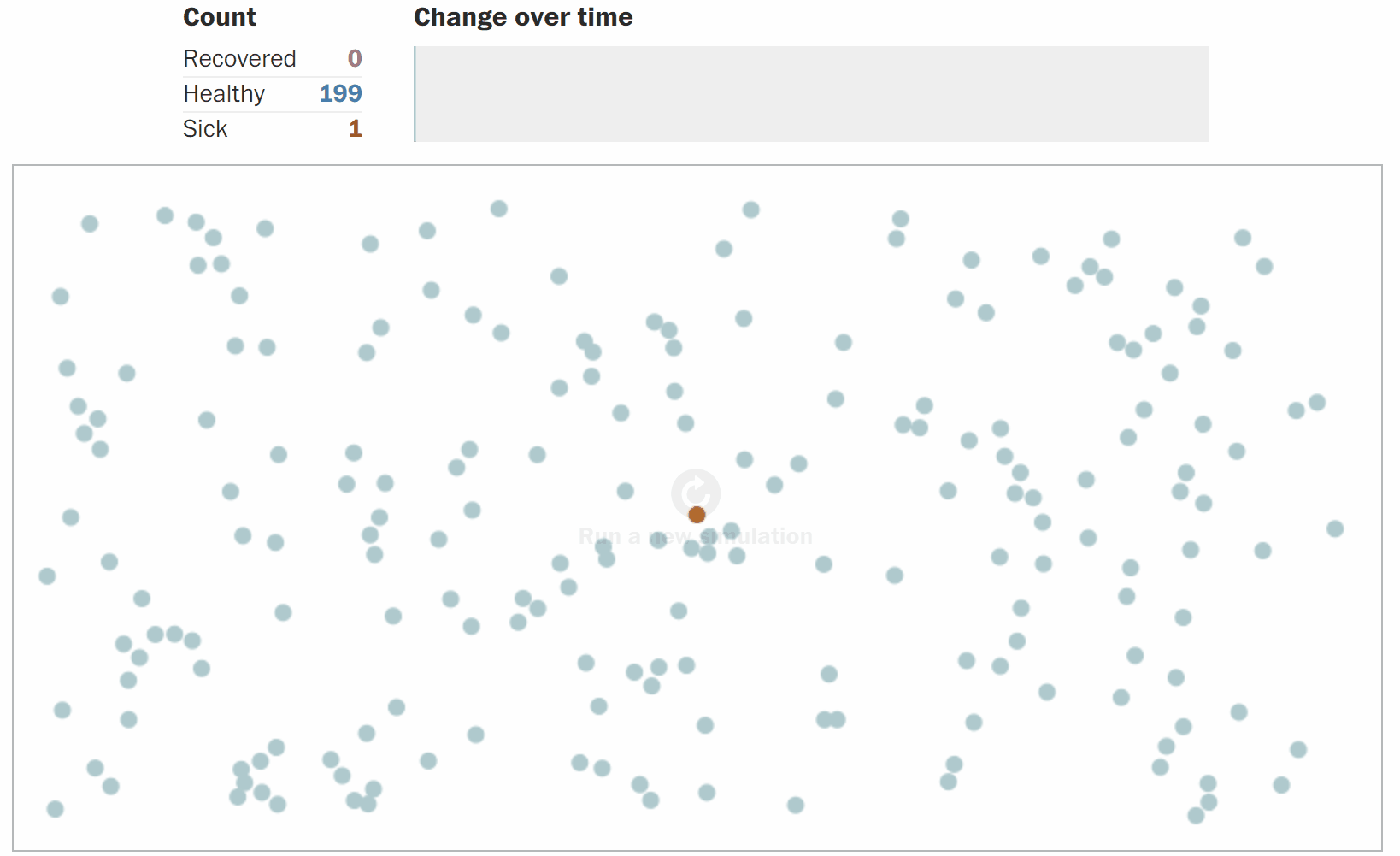
Simulation of high levels of social interaction and spreading of COVID-19. Source: The Washington Post
This article by The Washington Post illustrates why and how outbreaks like COVID-19 spread exponentially by using animated graphics that show us how we can flatten the spreading curve by social distancing.
Show this to that one friend who doesn’t want to stay at home.
6. Early measures vs late measures to combat the rate of infection

Early measures vs late measures to combat the rate of infection. Source: Our World in Data
Early countermeasures are essential to contain the infection rate in epidemics, and this visualization by Our World in Data illustrates this fact very well. Based on data from the Center for Disease Control and Prevention (CDC), we can see how healthcare systems can collapse due to late responses to the outbreak.
7. Infodemics Observatory

Infodemics Observatory COVID-19 dashboard. Infodemics Observatory
Infodemics Observatory created this dashboard visualizing the information spread about the COVID-19 outbreak. Using machine learning and sentiment analysis, they analyze millions of public messages to understand dimensions of collective sentiment and psychology and news reliability.
8. Novel Coronavirus (COVID-19) animated spread map
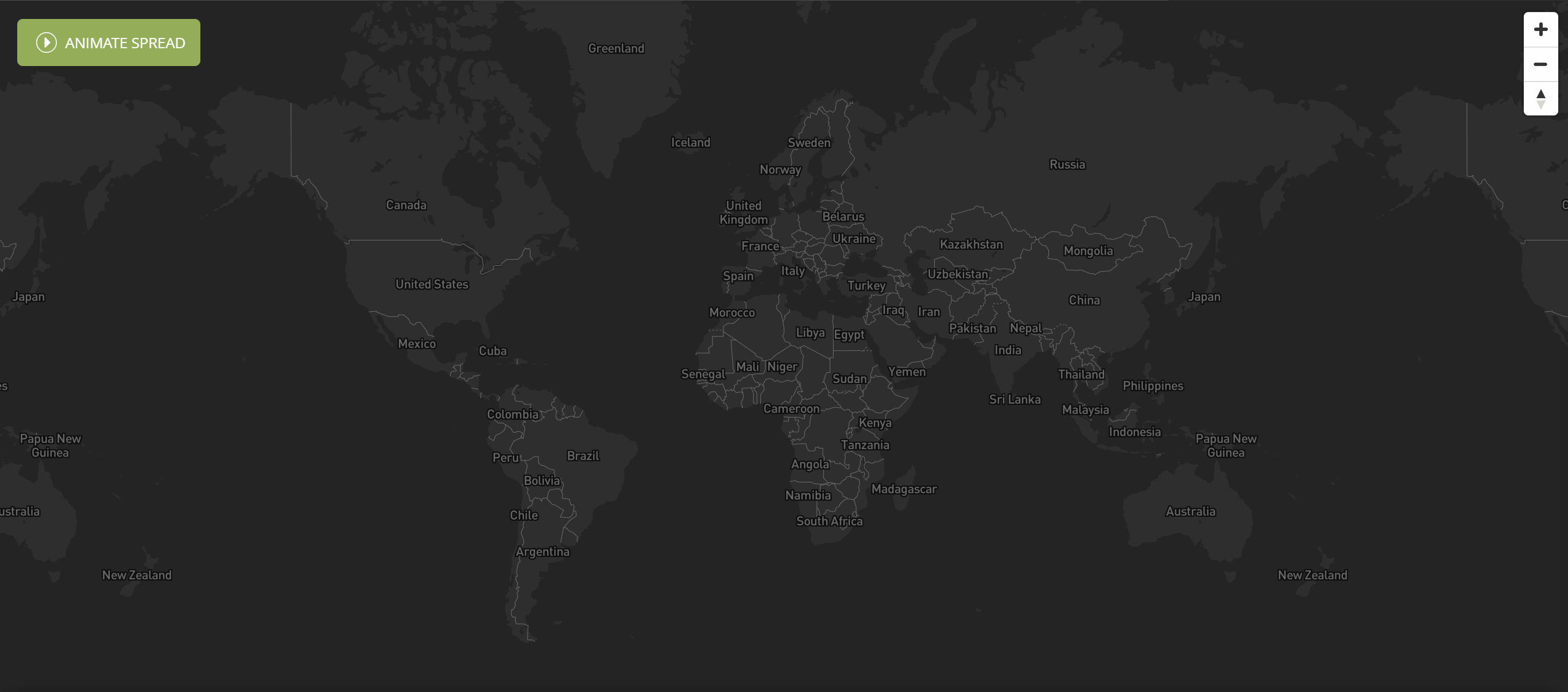
Animated spread map. Source: Health Map
Based on a variety of sources, this map is very similar to others. Although this one includes the option to animate the day-by-day spread of the illness around the world.
9. The Workers Who Face the Greatest Coronavirus Risk

Coronavirus risk by workers. Source: New York Times
Some workers face bigger risks of getting infected than others. This chart by the New York Times tells us which workers face the most exposure to the virus and how close they are to other people during their workdays.
As expected, health care workers are at the greatest risk.
10. COVID-19 Global Cases by CSSE

COVID-19 Global cases dashboard. Source: CSSE
This CSSE dashboard allows you to see all global confirmed cases, recoveries, and deaths, as well as numbers by region/country, and all of this is arranged so you can see everything in a single (a bit cramped) screen.
Do you know any other relevant data visualization about COVID-19 that should be on this list?
Share it in the comments and help other people get informed.
Click here to download a PDF version of this blog post.
References
- Bossenz, D. (2020, Mar 17). Live Tracking Coronavirus. Retrieved from https://public.tableau.com/profile/dilyana2344#!/vizhome/SARSvsCoronavirus2/Coronavirusvs_SARS
- Kaiser Family Foundation (2020, Mar 16). COVID-19 Coronavirus Tracker. Retrieved from https://www.kff.org/global-health-policy/fact-sheet/coronavirus-tracker/
- CNBC Digital (2020, Mar 14). Coronavirus Map. Retrieved from https://public.tableau.com/profile/cnbc5283#!/vizhome/CoronavirusMap/US
- Tableau (2020, Mar 16). Access and analyze trusted COVID-19 (Coronavirus) global data. Retrieved from https://www.tableau.com/covid-19-coronavirus-data-resources
- Tableau (2020, Mar 16). COVID-19 Cases. Retrieved from https://public.tableau.com/profile/covid.19.data.resource.hub#!/vizhome/COVID-19Cases_15840488375320/COVID-19Cases
- Information is beautiful (2020, Mar 13). COVID-19 #Coronavirus Data Pack. Retrieved from https://informationisbeautiful.net/visualizations/covid-19-coronavirus-infographic-datapack/
- Routley, N. (2020, Mar 16). Infection Trajectory: See Which Countries are Flattening Their COVID-19 Curve. Retrieved from https://www.visualcapitalist.com/infection-trajectory-flattening-the-covid19-curve/
- Stevens, H. (2020, Mar 14). Why outbreaks like coronavirus spread exponentially, and how to “flatten the curve”. Retrieved from https://www.washingtonpost.com/graphics/2020/world/corona-simulator/
- Danielson, M. (2020, Mar 12). Notable maps visualizing COVID-19 and surrounding impacts. Retrieved from https://blog.mapbox.com/notable-maps-visualizing-covid-19-and-surrounding-impacts-951724cc4bd8
- Gamio, L. (2020, Mar 15). The Workers Who Face the Greatest Coronavirus Risk. Retrieved from https://www.nytimes.com/interactive/2020/03/15/business/economy/coronavirus-worker-risk.html?smid=fb-share&fbclid=IwAR3qIMHEAHhZmhwfKAjwgVtAz3pCxW4LYyVtyAQ1snG2i9NAfgCLmMQeoyo
- South China Morning Post. (2020, Mar 18). Coronavirus: the new disease Covid-19 explained. Retrieved from https://multimedia.scmp.com/infographics/news/china/article/3047038/wuhan-virus/index.html?src=article-launcher
- Our World in Data. (2020) Total confirmed cases of COVID-19. Retrieved from https://ourworldindata.org/grapher/covid-confirmed-cases-since-100th-case
- Roser, M. (2020, Mar 17). Coronavirus Disease (COVID-19) – Statistics and Research. Retrieved from https://ourworldindata.org/coronavirus#growth-of-cases-how-long-did-it-take-for-the-number-of-confirmed-cases-to-double
- Infodemics Observatory. (2020, Mar 12). COVID19 Infodemics Observatory. Retrieved from https://covid19obs.fbk.eu/
- HealthMap. (2020, Mar 17). Novel Coronavirus (COVID-19). Retrieved from https://www.healthmap.org/covid-19/
- CSSE. (2020, Mar 18). Coronavirus COVID-19 Global Cases by the Center for Systems Science and Engineering (CSSE) at Johns Hopkins University (JHU). Retrieved from https://gisanddata.maps.arcgis.com/apps/opsdashboard/index.html#/bda7594740fd40299423467b48e9ecf6